![Concept70: [Mighty] Ducks d'Anaheim](http://dunikal.com/cdn/shop/articles/ANA-Fonce_4de8f48d-2498-4aa4-b22c-0e8822e53211.png?v=1669321639&width=3840)
This artwork is a re-imagining of the Mighty Ducks of Anaheim/Anaheim Ducks logo and uniforms as a seventies team.

To fit into the design era of the 70s, the logo and the uniform must follow certain rules:
- 2D (flat) design without shading, bevel, or perspective.
- Color restrictions. Two colors + white if possible.
- Primacy of form over color. The logo must be recognizable in black and white.
- Primacy of the abstract over the figurative.
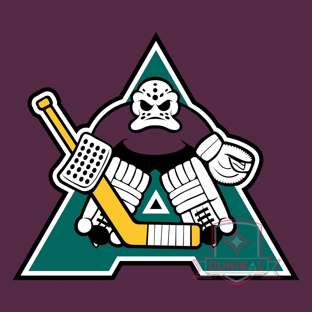
For the Anaheim Ducks, the main particularity is the nostalgic attachment to the original logo of the team when it debuted in 1993. So the concept was to imagine what the ancestor of this logo could have been if the team had existed in the seventies.
The main concept therefore comes from a form of reverse engineering, imagining the 93 logo as a simplified form of a more complex logo.
So creating a complete goalie so the mask would be the one that would become the 93 logo. This results in a logo that looks like the Pittsburgh Penguins. The bottom triangle is inverted, to create a letter A, for Anaheim.

The secondary logo is eminently “seventies”. A D shape - for "Ducks" - with wings forms the body of a duck, with a lowercase A - for "Anaheim" - forms the head.
The uniform is a simplification of the original 1993 Mighty Ducks uniforms, to match seventies standards.
0 comments